本篇文章将介绍如何在组件库中开发一个组件,其中包括
在packages目录下新建components和utils两个包,其中components就是我们组件存放的位置,而utils包则是存放一些公共的方法之类的。分别在两个文件下执行pnpm init,并将它们的包名改为@easyest/components和@easyest/utils
{ "name": "@easyest/components", "version": "1.0.0", "description": "", "main": "index.ts", "scripts": { "test": "echo \"Error: no test specified\" && exit 1" }, "keywords": [], "author": "", "license": "ISC" }
在components目录下新建src目录用于存放所有组件,最终目录结构为
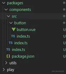
当然这只是目前的结构,后面会进行调整,因为还有样式,测试等文件目录
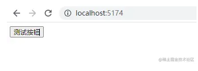
在button.vue文件中写一个简单的按钮
测试按钮
然后在button/index.ts将其导出
import Button from "./button.vue"; export { Button }; export default Button;
因为我们后面会有很多组件的,比如 Icon,Upload,Select 等,所以我们需要在components/src/index.ts集中导出所有组件
export * from "./button";
最后在components/index.ts导出所有组件提供给外部使用
export * from "./src/index";
接下来我们在上篇文章中搭建的 play 项目中进行一个测试,首先在 paly 项目中本地安装@easyest/components(组件库包名,后续发布可以自己修改名字)
pnpm add @easyest/components
然后再app.vue中引用Button
import { Button } from "@easyest/components"; " _ue_custom_node_="true">
启动项目便可以看到 Button 组件了,并且修改 Button 组件也会有热更新的效果
有的时候我们使用组件的时候想要直直接使用 app.use()挂载整个组件库,其实使用 app.use()的时候它会调用传入参数的 install 方法,因此首先我们给每个组件添加一个 install 方法,然后再导出整个组件库,我们将 button/index.ts 改为
import _Button from "./button.vue"; import type { App, Plugin } from "vue"; type SFCWithInstall= T & Plugin; const withInstall =(comp: T) => { (comp as SFCWithInstall).install = (app: App) => { const name = (comp as any).name; //注册组件 app.component(name, comp as SFCWithInstall); }; return comp as SFCWithInstall; }; export const Button = withInstall(_Button); export default Button;
components/index.ts 修改为
import * as components from "./src/index"; export * from "./src/index"; import { App } from "vue"; export default { install: (app: App) => { for (let c in components) { app.use(components[c]); } }, };
此时我们需要给button.vue一个name:ea-button好在全局挂载的时候作为组件名使用
测试按钮 import { defineComponent } from "vue"; export default defineComponent({ name: "ea-button", setup() { return {}; }, }); " _ue_custom_node_="true">
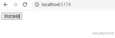
这时候在play/main.ts中全局挂载组件库
import { createApp } from "vue"; import App from "./app.vue"; import easyest from "@easyest/components"; const app = createApp(App); app.use(easyest); app.mount("#app");
app.vue 中使用ea-button组件,然后就会发现组件库挂载成功了
但是这个全局组件并没有任何属性提示,所以我们要借助vscode中的volar给全局组件加上提示效果
首先安装@vue/runtime-core
pnpm add @vue/runtime-core -D -w
在src下新建components.d.ts
import * as components from "./index"; declare module "@vue/runtime-core" { export interface GlobalComponents { EaButton: typeof components.Button; EaIcon: typeof components.Icon; } }
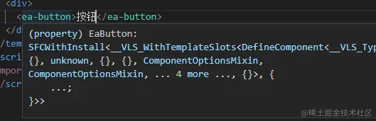
此时全局引入的组件也有了提示效果
注意:当用户使用组件库的时候需要让用户在tsconfig.json中配置types:["easyest/lib/src/components"]才会出现提示效果
"compilerOptions": { //... "types": ["easyest/lib/src/components"] },
我们都知道,使用 setup 语法进行 Vue 组件的开发是非常方便的,但是会有一个问题,就是当我们使用 setup 语法时该怎么给组件命名呢?
其实有两种解决方法,一个是再写一个script标签命名,比如input.vue
测试按钮import { defineComponent } from "vue"; export default defineComponent({ name: "ea-button" }); " _ue_custom_node_="true">
这种方式显然是比较奇怪的
第二种方式就是使用插件unplugin-vue-define-options解决,在测试环境中,我们需要把它配置在 play 项目中
首先全局安装unplugin-vue-define-options,因为这个插件后面打包配置也需要用到,最新版本安装会提示错误,看后续作者如何解决吧,暂时用// @ts-ignore忽略
pnpm add unplugin-vue-define-options -D -w
然后在play/vite.config.ts引入该插件
import { defineConfig } from "vite"; import vue from "@vitejs/plugin-vue"; // @ts-ignore import DefineOptions from "unplugin-vue-define-options/vite"; export default defineConfig({ plugins: [vue(), DefineOptions()], });
此时我们便可以直接使用defineOptions函数定义组件名了
测试按钮defineOptions({ name: "ea-button" }); " _ue_custom_node_="true">
我们都知道一个组件需要接受一些参数来实现不同效果,比如 Button 组件就需要接收type、size、round等属性,这里我们暂且只接收一个属性type来开发一个简单的 Button 组件。
我们可以根据传入的不同type来赋予 Button 组件不同类名
// button.vue import "./style/index.less"; import { computed } from "vue"; defineOptions({ name: "ea-button" }); type ButtonProps = { type?: string; }; const buttonProps = defineProps(); const buttonStyle = computed(() => { return { [`ea-button--${buttonProps.type}`]: buttonProps.type }; }); " _ue_custom_node_="true">
这里引入了样式文件,在 button 目录下新建 style 文件夹来存放 Button 组件的样式
src/button/style/index.less如下
.ea-button { display: inline-block; line-height: 1; white-space: nowrap; cursor: pointer; background: #fff; border: 1px solid #dcdfe6; color: #606266; -webkit-appearance: none; text-align: center; box-sizing: border-box; outline: none; margin: 0; transition: 0.1s; font-weight: 500; padding: 12px 20px; font-size: 14px; border-radius: 4px; } .ea-button.ea-button--primary { color: #fff; background-color: #409eff; border-color: #409eff; &:hover { background: #66b1ff; border-color: #66b1ff; color: #fff; } }
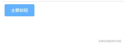
此时在 app.vue 中引入 Button 组件就可以看到想要的效果了
主要按钮 import { Button } from "@easyest/components"; " _ue_custom_node_="true">
由于组件的开发可能涉及的内容比较多,这里就不详细展开,这里只简单介绍一下组件开发的大致思路,后续会专门对一些常用组件进行开发,欢迎点赞收藏加关注!
本文对应代码地址 如何开发一个组件,动动小手Star一下谢谢
文章已收录专栏juejin.cn/column/7118… 感兴趣的可以关注一下
Copyright © 2023 leiyu.cn. All Rights Reserved. 磊宇云计算 版权所有 许可证编号:B1-20233142/B2-20230630 山东磊宇云计算有限公司 鲁ICP备2020045424号
磊宇云计算致力于以最 “绿色节能” 的方式,让每一位上云的客户成为全球绿色节能和降低碳排放的贡献者