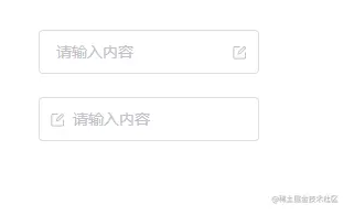
通过prefix-icon和suffix-icon 属性可以为Input组件添加首尾图标。
可以通过计算属性判断出是否显示首尾图标,防止和前面的clearable和show-password冲突.这里代码做了
<input ref="ipt" class="k-input__inner" :class="{ ['k-input--prefix']: isShowPrefixIcon }" :disabled="inputProps.disabled" v-bind="attrs" :value="inputProps.modelValue" @input="changeInputVal" /> //... type InputProps = { prefixIcon?: string; suffixIcon?: string; }; //... //带Icon输入框 const isShowSuffixIcon = computed(() => { return ( inputProps.suffixIcon && !inputProps.clearable && !inputProps.showPassword ); }); const isShowPrefixIcon = computed(() => { return inputProps.prefixIcon; }); " _ue_custom_node_="true">
相关样式部分
.k-input__suffix, .k-input__prefix { position: absolute; right: 10px; height: 100%; top: 0; display: flex; align-items: center; cursor: pointer; color: #c0c4cc; font-size: 15px; } .no-cursor { cursor: default; } .k-input--prefix.k-input__inner { padding-left: 30px; } .k-input__prefix { position: absolute; width: 20px; cursor: default; left: 10px; }
在app.vue中使用效果如下
import { Input } from "kitty-ui"; import { ref } from "vue"; const tel = ref(""); " _ue_custom_node_="true">.input-demo { width: 200px; } " _ue_custom_node_="true">
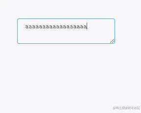
将type属性的值指定为textarea即可展示文本域模式。它绑定的事件以及属性和input基本一样
<textarea class="k-textarea__inner" :style="textareaStyle" v-bind="attrs" ref="textarea" :value="inputProps.modelValue" @input="changeInputVal" /> <div v-else class="k-input" @mouseenter="isEnter = true" @mouseleave="isEnter = false" :class="styleClass" > ...
样式基本也就是focus,hover改变 border 颜色
.k-textarea { width: 100%; .k-textarea__inner { display: block; padding: 5px 15px; line-height: 1.5; box-sizing: border-box; width: 100%; font-size: inherit; color: #606266; background-color: #fff; background-image: none; border: 1px solid #dcdfe6; border-radius: 4px; &::placeholder { color: #c2c2ca; } &:hover { border: 1px solid #c0c4cc; } &:focus { outline: none; border: 1px solid #409eff; } } }

组件可以通过接收autosize属性来开启自适应高度,同时autosize也可以传对象形式来指定最小和最大行高
type AutosizeObj = { minRows?: number maxRows?: number } type InputProps = { autosize?: boolean | AutosizeObj }
具体实现原理是通过监听输入框值的变化来调整textarea的样式,其中用到了一些原生的方法譬如window.getComputedStyle(获取原生css对象),getPropertyValue(获取css属性值)等,所以原生js忘记的可以复习一下
... const textareaStyle = ref() const textarea = shallowRef() watch(() => inputProps.modelValue, () => { if (attrs.type === 'textarea' && inputProps.autosize) { const minRows = isObject(inputProps.autosize) ? (inputProps.autosize as AutosizeObj).minRows : undefined const maxRows = isObject(inputProps.autosize) ? (inputProps.autosize as AutosizeObj).maxRows : undefined nextTick(() => { textareaStyle.value = calcTextareaHeight(textarea.value!, minRows, maxRows) }) } }, { immediate: true })
其中calcTextareaHeight为
const isNumber = (val: any): boolean => { return typeof val === 'number' } //隐藏的元素 let hiddenTextarea: HTMLTextAreaElement | undefined = undefined //隐藏元素样式 const HIDDEN_STYLE = ` height:0 !important; visibility:hidden !important; overflow:hidden !important; position:absolute !important; z-index:-1000 !important; top:0 !important; right:0 !important; ` const CONTEXT_STYLE = [ 'letter-spacing', 'line-height', 'padding-top', 'padding-bottom', 'font-family', 'font-weight', 'font-size', 'text-rendering', 'text-transform', 'width', 'text-indent', 'padding-left', 'padding-right', 'border-width', 'box-sizing', ] type NodeStyle = { contextStyle: string boxSizing: string paddingSize: number borderSize: number } type TextAreaHeight = { height: string minHeight?: string } function calculateNodeStyling(targetElement: Element): NodeStyle { //获取实际textarea样式返回并赋值给隐藏的textarea const style = window.getComputedStyle(targetElement) const boxSizing = style.getPropertyValue('box-sizing') const paddingSize = Number.parseFloat(style.getPropertyValue('padding-bottom')) + Number.parseFloat(style.getPropertyValue('padding-top')) const borderSize = Number.parseFloat(style.getPropertyValue('border-bottom-width')) + Number.parseFloat(style.getPropertyValue('border-top-width')) const contextStyle = CONTEXT_STYLE.map( (name) => `${name}:${style.getPropertyValue(name)}` ).join(';') return { contextStyle, paddingSize, borderSize, boxSizing } } export function calcTextareaHeight( targetElement: HTMLTextAreaElement, minRows = 1, maxRows?: number ): TextAreaHeight { if (!hiddenTextarea) { //创建隐藏的textarea hiddenTextarea = document.createElement('textarea') document.body.appendChild(hiddenTextarea) } //给隐藏的teatarea赋予实际textarea的样式以及值(value) const { paddingSize, borderSize, boxSizing, contextStyle } = calculateNodeStyling(targetElement) hiddenTextarea.setAttribute('style', `${contextStyle};${HIDDEN_STYLE}`) hiddenTextarea.value = targetElement.value || targetElement.placeholder || '' //隐藏textarea整个高度,包括内边距padding,border let height = hiddenTextarea.scrollHeight const result = {} as TextAreaHeight //判断boxSizing,返回实际高度 if (boxSizing === 'border-box') { height = height + borderSize } else if (boxSizing === 'content-box') { height = height - paddingSize } hiddenTextarea.value = '' //计算单行高度 const singleRowHeight = hiddenTextarea.scrollHeight - paddingSize if (isNumber(minRows)) { let minHeight = singleRowHeight * minRows if (boxSizing === 'border-box') { minHeight = minHeight + paddingSize + borderSize } height = Math.max(minHeight, height) result.minHeight = `${minHeight}px` } if (isNumber(maxRows)) { let maxHeight = singleRowHeight * maxRows! if (boxSizing === 'border-box') { maxHeight = maxHeight + paddingSize + borderSize } height = Math.min(maxHeight, height) } result.height = `${height}px` hiddenTextarea.parentNode?.removeChild(hiddenTextarea) hiddenTextarea = undefined return result }
这里的逻辑稍微复杂一点,大致就是创建一个隐藏的
textarea,然后每次当输入框值发生变化时,将它的value赋值为组件的textarea的value,最后计算出这个隐藏的textarea的scrollHeight以及其它padding之类的值并作为高度返回赋值给组件中的textarea
最后在app.vue中使用
<Input v-model="tel" :autosize="{ minRows: 2 }" type="textarea" suffixIcon="edit" placeholder="请输入内容" />
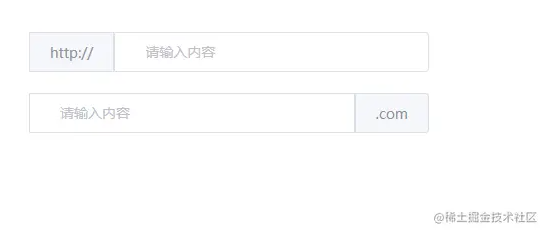
我们可以使用复合型输入框来前置或者后置我们的元素,如下所示
这里我们借助 vue3 中的slot进行实现,其中用到了useSlots来判断用户使用了哪个插槽,从而展示不同样式
import { useSlots } from "vue"; //复合输入框 const slots = useSlots();
同时template中接收前后两个插槽
<div class="k-input" @mouseenter="isEnter = true" @mouseleave="isEnter = false" :class="styleClass" > <input ref="ipt" class="k-input__inner" :class="inputStyle" :disabled="inputProps.disabled" v-bind="attrs" :value="inputProps.modelValue" @input="changeInputVal" /> import { useSlots } from "vue"; const styleClass = computed(() => { return { ["k-input-group k-input-prepend"]: slots.prepend, ["k-input-group k-input-append"]: slots.append, }; }); //复合输入框 const slots = useSlots(); " _ue_custom_node_="true">
最后给两个插槽写上样式就实现了复合型输入框啦
.k-input.k-input-group.k-input-append, .k-input.k-input-group.k-input-prepend { line-height: normal; display: inline-table; width: 100%; border-collapse: separate; border-spacing: 0; .k-input__inner { border-radius: 0 4px 4px 0; } //复合输入框 .k-input__prepend, .k-input__append { background-color: #f5f7fa; color: #909399; vertical-align: middle; display: table-cell; position: relative; border: 1px solid #dcdfe6; border-radius: 4 0px 0px 4px; padding: 0 20px; width: 1px; white-space: nowrap; } .k-input__append { border-radius: 0 4px 4px 0px; } } .k-input.k-input-group.k-input-append { .k-input__inner { border-top-right-radius: 0px; border-bottom-right-radius: 0px; } }
在app.vue中使用
http:// .com
一个看似简单的Input组件其实包含的内容还是很多的,做完之后会发现对自己很多地方都有提升和帮助。
如果你对vue3组件库开发也感兴趣的话可以关注专栏Vite+TypeScript从零搭建Vue3组件库 - 东方小月的专栏 - 掘金 (juejin.cn) 组件库的所有实现细节都在这个专栏里,包括环境搭建,自动打包发布,文档搭建,vitest单元测试等等。
如果这篇文章对你有所帮助动动指头点个赞吧~
kitty-ui: 一个使用Vite+Ts搭建的Vue3组件库
Copyright © 2023 leiyu.cn. All Rights Reserved. 磊宇云计算 版权所有 许可证编号:B1-20233142/B2-20230630 山东磊宇云计算有限公司 鲁ICP备2020045424号
磊宇云计算致力于以最 “绿色节能” 的方式,让每一位上云的客户成为全球绿色节能和降低碳排放的贡献者