
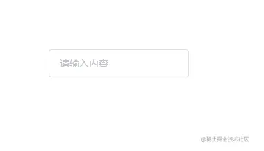
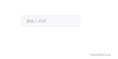
首先先新建一个input.vue文件,然后写入一个最基本的input输入框
然后在我们的 vue 项目examples下的app.vue引入Input组件
import { Input } from "kitty-ui"; " _ue_custom_node_="true">
此时页面上便出现了原生的输入框,所以需要对这个输入框进行样式的添加,在input.vue同级新建style/index.less,Input样式便写在这里
.k-input { font-size: 14px; display: inline-block; position: relative; .k-input__inner { background-color: #fff; border-radius: 4px; border: 1px solid #dcdfe6; box-sizing: border-box; color: #606266; display: inline-block; font-size: inherit; height: 40px; line-height: 40px; outline: none; padding: 0 15px; width: 100%; &::placeholder { color: #c2c2ca; } &:hover { border: 1px solid #c0c4cc; } &:focus { border: 1px solid #409eff; } } }
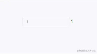
接下来要实现Input组件的核心功能:双向数据绑定。当我们在 vue 中使用input输入框的时候,我们可以直接使用v-model来实现双向数据绑定,v-model其实就是value @input结合的语法糖。而在 vue3 组件中使用v-model则表示的是modelValue @update:modelValue的语法糖。比如Input组件为例
其实就是
所以在input.vue中我们就可以根据这个来实现Input组件的双向数据绑定,这里我们使用setup语法
<input class="k-input__inner" :value="inputProps.modelValue" @input="changeInputVal" /> //组件命名 defineOptions({ name: "k-input", }); //组件接收的值类型 type InputProps = { modelValue?: string | number; }; //组件发送事件类型 type InputEmits = { (e: "update:modelValue", value: string): void; }; //withDefaults可以为props添加默认值等 const inputProps = withDefaults(defineProps(), { modelValue: "", }); const inputEmits = defineEmits(); const changeInputVal = (event: Event) => { inputEmits("update:modelValue", (event.target as HTMLInputElement).value); }; " _ue_custom_node_="true">
到这里基础用法就完成了,接下来开始实现禁用状态
这个比较简单,只要根据props的disabled来赋予禁用类名即可
<input class="k-input__inner" :value="inputProps.modelValue" @input="changeInputVal" :disabled="inputProps.disabled" /> //... type InputProps = { modelValue?: string | number; disabled?: boolean; }; //... //根据props更改类名 const styleClass = computed(() => { return { "is-disabled": inputProps.disabled, }; }); " _ue_custom_node_="true">
然后给is-disabled写些样式
//... .k-input.is-disabled { .k-input__inner { background-color: #f5f7fa; border-color: #e4e7ed; color: #c0c4cc; cursor: not-allowed; &::placeholder { color: #c3c4cc; } } }
按钮尺寸包括medium,small,mini,不传则是默认尺寸。同样的根据props的size来赋予不同类名
const styleClass = computed(() => { return { "is-disabled": inputProps.disabled, [`k-input--${inputProps.size}`]: inputProps.size, }; });
然后写这三个类名的不同样式
//... .k-input.k-input--medium { .k-input__inner { height: 36px; &::placeholder { font-size: 15px; } } } .k-input.k-input--small { .k-input__inner { height: 32px; &::placeholder { font-size: 14px; } } } .k-input.k-input--mini { .k-input__inner { height: 28px; &::placeholder { font-size: 13px; } } }
原生的input有type,placeholder等属性,这里可以使用 vue3 中的useAttrs来实现props穿透.子组件可以通过v-bind将props绑定
<input class="k-input__inner" :value="inputProps.modelValue" @input="changeInputVal" :disabled="inputProps.disabled" v-bind="attrs" /> //... const attrs = useAttrs(); " _ue_custom_node_="true">
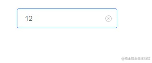
通过clearable属性、Input的值是否为空以及是否鼠标是否移入来判断是否需要显示可清空图标。图标则使用组件库的Icon组件
<div class="k-input" @mouseenter="isEnter = true" @mouseleave="isEnter = false" :class="styleClass" > <input class="k-input__inner" :disabled="inputProps.disabled" v-bind="attrs" :value="inputProps.modelValue" @input="changeInputVal" /> <div @click="clearValue" v-if="inputProps.clearable && isClearAbled" v-show="isFoucs" class="k-input__suffix" > //... import Icon from "../icon/index"; //... //双向数据绑定&接收属性 type InputProps = { modelValue?: string | number; disabled?: boolean; size?: string; clearable?: boolean; }; //... const isClearAbled = ref(false); const changeInputVal = (event: Event) => { //可清除clearable (event.target as HTMLInputElement).value ? (isClearAbled.value = true) : (isClearAbled.value = false); inputEmits("update:modelValue", (event.target as HTMLInputElement).value); }; //清除input value const isEnter = ref(true); const clearValue = () => { inputEmits("update:modelValue", ""); }; " _ue_custom_node_="true">
清除图标部分 css 样式
.k-input__suffix { position: absolute; right: 10px; height: 100%; top: 0; display: flex; align-items: center; cursor: pointer; color: #c0c4cc; }
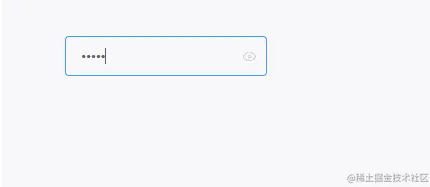
通过传入show-password属性可以得到一个可切换显示隐藏的密码框。这里要注意的是如果传了clearable则不会显示切换显示隐藏的图标
<div class="k-input" @mouseenter="isEnter = true" @mouseleave="isEnter = false" :class="styleClass" > <input ref="ipt" class="k-input__inner" :disabled="inputProps.disabled" v-bind="attrs" :value="inputProps.modelValue" @input="changeInputVal" /> //... const attrs = useAttrs(); //... //显示隐藏密码框 showPassword const ipt = ref(); Promise.resolve().then(() => { if (inputProps.showPassword) { ipt.value.type = "password"; } }); const eyeIcon = ref("browse"); const isShowEye = computed(() => { return ( inputProps.showPassword && inputProps.modelValue && !inputProps.clearable ); }); const changeType = () => { if (ipt.value.type === "password") { eyeIcon.value = "eye-close"; ipt.value.type = attrs.type || "text"; return; } ipt.value.type = "password"; eyeIcon.value = "browse"; }; " _ue_custom_node_="true">
这里是通过获取
input元素,然后通过它的type属性进行切换,其中browse和eye-close分别是Icon组件中眼睛开与闭,效果如下
Copyright © 2023 leiyu.cn. All Rights Reserved. 磊宇云计算 版权所有 许可证编号:B1-20233142/B2-20230630 山东磊宇云计算有限公司 鲁ICP备2020045424号
磊宇云计算致力于以最 “绿色节能” 的方式,让每一位上云的客户成为全球绿色节能和降低碳排放的贡献者