Scaffold是一个Flutter小部件,用于定义应用程序的基本布局元素,例如应用程序栏、抽屉式菜单、底部导航栏和浮动操作按钮等。它是一个方便的小部件,可以帮助您快速构建具有常见应用程序组件的布局。
Scaffold小部件通常包含以下元素:
AppBar:位于页面顶部,通常用于显示应用程序名称、菜单按钮、搜索框或其他重要控件。
BottomNavigationBar:位于页面底部,通常用于允许用户切换不同的页面或功能。
Drawer:可从屏幕左侧滑动出现的侧边栏,通常用于显示应用程序的导航菜单或其他重要信息。
FloatingActionButton:一个浮动的圆形按钮,通常用于触发最常用的操作。
body:通常是应用程序中最重要的部分,它包含应用程序的实际内容,例如列表、表单、图像或其他小部件。
下面是一个简单的示例,演示如何使用Scaffold来创建一个包含AppBar和body的基本布局:
import 'package:flutter/material.dart'; void main() => runApp(MyApp()); class MyApp extends StatelessWidget { @override Widget build(BuildContext context) { return MaterialApp( title: 'My App', home: Scaffold( appBar: AppBar( title: Text('My App'), ), body: Center( child: Text('Hello World!'), ), ), ); } }
在这个例子中,我们创建了一个名为MyApp的Flutter应用程序。我们使用Scaffold小部件作为home属性的值,来定义应用程序的基本布局。我们设置了应用程序栏的标题为My App,并将页面的主体设置为一个居中对齐的文本小部件,显示Hello World!。
总之,Scaffold是一个非常有用的小部件,它可以让您快速构建具有常见应用程序组件的布局。它还提供了许多自定义选项,可以让您根据需要修改应用程序的外观和行为。
const Scaffold( {Key? key, PreferredSizeWidget? appBar, Widget? body, Widget? floatingActionButton, FloatingActionButtonLocation? floatingActionButtonLocation, FloatingActionButtonAnimator? floatingActionButtonAnimator, List? persistentFooterButtons, AlignmentDirectional persistentFooterAlignment = AlignmentDirectional.centerEnd, Widget? drawer, DrawerCallback? onDrawerChanged, Widget? endDrawer, DrawerCallback? onEndDrawerChanged, Widget? bottomNavigationBar, Widget? bottomSheet, Color? backgroundColor, bool? resizeToAvoidBottomInset, bool primary = true, DragStartBehavior drawerDragStartBehavior = DragStartBehavior.start, bool extendBody = false, bool extendBodyBehindAppBar = false, Color? drawerScrimColor, double? drawerEdgeDragWidth, bool drawerEnableOpenDragGesture = true, bool endDrawerEnableOpenDragGesture = true, String? restorationId} )
appBar → PreferredSizeWidget?
An app bar to display at the top of the scaffold.
final
backgroundColor → Color?
The color of the Material widget that underlies the entire Scaffold.
final
body → Widget?
The primary content of the scaffold.
final
bottomNavigationBar → Widget?
A bottom navigation bar to display at the bottom of the scaffold.
final
bottomSheet → Widget?
The persistent bottom sheet to display.
final
drawer → Widget?
A panel displayed to the side of the body, often hidden on mobile devices. Swipes in from either left-to-right (TextDirection.ltr) or right-to-left (TextDirection.rtl)
final
drawerDragStartBehavior → DragStartBehavior
Determines the way that drag start behavior is handled.
final
drawerEdgeDragWidth → double?
The width of the area within which a horizontal swipe will open the drawer.
final
drawerEnableOpenDragGesture → bool
Determines if the Scaffold.drawer can be opened with a drag gesture on mobile.
final
drawerScrimColor → Color?
The color to use for the scrim that obscures primary content while a drawer is open.
final
endDrawer → Widget?
A panel displayed to the side of the body, often hidden on mobile devices. Swipes in from right-to-left (TextDirection.ltr) or left-to-right (TextDirection.rtl)
final
endDrawerEnableOpenDragGesture → bool
Determines if the Scaffold.endDrawer can be opened with a gesture on mobile.
final
extendBody → bool
If true, and bottomNavigationBar or persistentFooterButtons is specified, then the body extends to the bottom of the Scaffold, instead of only extending to the top of the bottomNavigationBar or the persistentFooterButtons.
final
extendBodyBehindAppBar → bool
If true, and an appBar is specified, then the height of the body is extended to include the height of the app bar and the top of the body is aligned with the top of the app bar.
final
floatingActionButton → Widget?
A button displayed floating above body, in the bottom right corner.
final
floatingActionButtonAnimator → FloatingActionButtonAnimator?
Animator to move the floatingActionButton to a new floatingActionButtonLocation.
final
floatingActionButtonLocation → FloatingActionButtonLocation?
Responsible for determining where the floatingActionButton should go.
final
hashCode → int
The hash code for this object.
@nonVirtual, read-only, inherited
key → Key?
Controls how one widget replaces another widget in the tree.
final, inherited
onDrawerChanged → DrawerCallback?
Optional callback that is called when the Scaffold.drawer is opened or closed.
final
onEndDrawerChanged → DrawerCallback?
Optional callback that is called when the Scaffold.endDrawer is opened or closed.
final
persistentFooterAlignment → AlignmentDirectional
The alignment of the persistentFooterButtons inside the OverflowBar.
final
persistentFooterButtons → List
A set of buttons that are displayed at the bottom of the scaffold.
final
primary → bool
Whether this scaffold is being displayed at the top of the screen.
final
resizeToAvoidBottomInset → bool?
If true the body and the scaffold’s floating widgets should size themselves to avoid the onscreen keyboard whose height is defined by the ambient MediaQuery’s MediaQueryData.viewInsets bottom property.
final
restorationId → String?
Restoration ID to save and restore the state of the Scaffold.
final
runtimeType → Type
A representation of the runtime type of the object.
read-only, inherited
见下面的例子
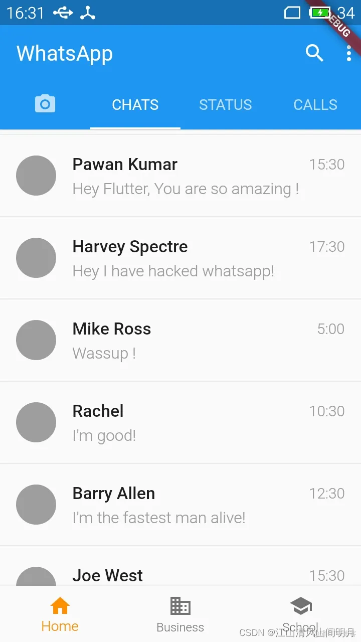
Widget build(BuildContext context) { return Scaffold( appBar: AppBar( title: Text("WhatsApp"), elevation: 0.7, bottom: TabBar( controller: _tabController, indicatorColor: Colors.blue, tabs:[ Tab(icon: Icon(Icons.camera_alt)), Tab(text: "CHATS"), Tab(text: "STATUS"), Tab(text: "CALLS"), ], ), actions:[ Icon(Icons.search), Padding( padding: const EdgeInsets.symmetric(horizontal: 5.0), ), Icon(Icons.more_vert) ], ), body: TabBarView( controller: _tabController, children:[ CameraScreen(widget.cameras), ChatScreen(), StatusScreen(), CallsScreen(), ], ), floatingActionButton: showFab ? FloatingActionButton( backgroundColor: Theme.of(context).accentColor, child: Icon( Icons.add, color: Colors.white, ), onPressed: () => debugDumpApp(), ) : null, bottomNavigationBar: BottomNavigationBar( items: const[ BottomNavigationBarItem( icon: Icon(Icons.home), label: 'Home', ), BottomNavigationBarItem( icon: Icon(Icons.business), label: 'Business', ), BottomNavigationBarItem( icon: Icon(Icons.school), label: 'School', ), ], // currentIndex: _selectedIndex, selectedItemColor: Colors.amber[800], onTap: _onItemTapped, ), ); }
上述代码运行起来的效果如下:
Copyright © 2023 leiyu.cn. All Rights Reserved. 磊宇云计算 版权所有 许可证编号:B1-20233142/B2-20230630 山东磊宇云计算有限公司 鲁ICP备2020045424号
磊宇云计算致力于以最 “绿色节能” 的方式,让每一位上云的客户成为全球绿色节能和降低碳排放的贡献者