在前三篇文章中,从为什么要使用Sliver,再根据使用频率逐个解析Slivers系列的组件。相信您已经入门了Sliver的世界。为了更好的将Slivers相关的组件结合起来使用,本文将通过一个综合的案例来帮助你理解。
源代码:https://www.aliyundrive.com/s/mPCDFwRv4Rm
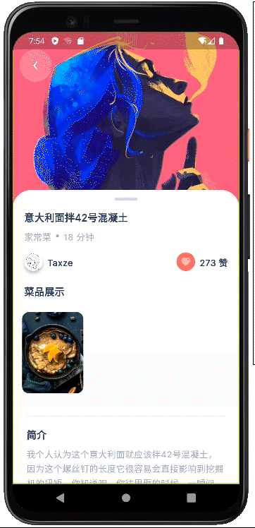
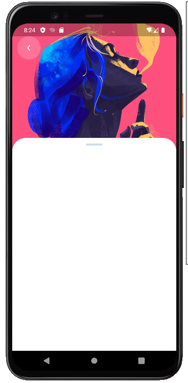
话不多说,先上效果图,有图有真相!
SliverAppBar(
//指定状态栏(status bar)的亮度为暗色
systemOverlayStyle:
const SystemUiOverlayStyle(statusBarBrightness: Brightness.dark),
expandedHeight: 275.0,
backgroundColor: Colors.white,
elevation: 0.0,
pinned: true,
stretch: true,
flexibleSpace: FlexibleSpaceBar(
background: Image.asset(
'assets/images/back_image.png',
fit: BoxFit.cover,
),
stretchModes: const [
StretchMode.blurBackground,
StretchMode.zoomBackground,
],
),
leadingWidth: 80.0,
//裁剪为圆角矩形
leading: ClipRRect(
borderRadius: BorderRadius.circular(56.0),
//模糊滤镜
child: BackdropFilter(
filter: ImageFilter.blur(sigmaX: 3.0, sigmaY: 3.0),
child: Container(
height: 56.0,
width: 56.0,
alignment: Alignment.center,
decoration: BoxDecoration(
shape: BoxShape.circle,
color: Colors.white.withOpacity(0.20),
),
child: SvgPicture.asset('assets/images/icon/arrow-ios-back-outline.svg'),
),
),
),
);
bottom: PreferredSize(
preferredSize: const Size.fromHeight(0.0),
child: Container(
height: 32.0,
alignment: Alignment.center,
decoration: const BoxDecoration(
color: Colors.white,
borderRadius: BorderRadius.only(
topLeft: Radius.circular(32.0),
topRight: Radius.circular(32.0),
),
),
child: Container(
width: 40.0,
height: 5.0,
decoration: BoxDecoration(
color: kOutlineColor,
borderRadius: BorderRadius.circular(100.0),
),
),
),
),
SliverToBoxAdapter来使用基于Box协议的组件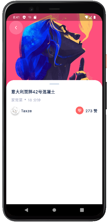
SliverToBoxAdapter(
child: Padding(
padding: EdgeInsets.symmetric(horizontal: 20),
child: Column(
crossAxisAlignment: CrossAxisAlignment.start,
children: [
Text(
'意大利面拌42号混凝土',
style: Theme.of(context).textTheme.titleMedium,
),
...
],
),
),
),
SliverPersistentHeader制作菜品展示区域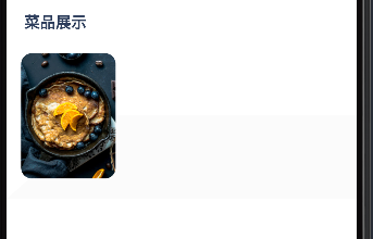
class Menu extends SliverPersistentHeaderDelegate {
...
@override
Widget build(
BuildContext context, double shrinkOffset, bool overlapsContent) {
...
return Container(
child: Column(
crossAxisAlignment: CrossAxisAlignment.start,
children: [
...
Text(
'菜品展示',
style: Theme.of(context).textTheme.titleMedium,
),
Expanded(
child: Stack(
children: [
//控制层叠关系
if (percent > uploadlimit) ...[
card,
bottomsliverbar
] else ...[
bottomsliverbar,
card
]
],
),
),
],
),
);
}
@override
double get maxExtent => maxExtended;
@override
double get minExtent => minExtended;
@override
bool shouldRebuild(covariant SliverPersistentHeaderDelegate oldDelegate) =>
false;
}
Stack结合Transform实现@override
Widget build(
BuildContext context, double shrinkOffset, bool overlapsContent) {
//shrinkOffset为SliverPersistentHeader滚动偏移量,用于对应图片的偏移程度
final percent = shrinkOffset / 180;
//限制图片偏移的触发范围
final uploadlimit = 13 / 120;
//使用clamp限制范围
final valueback = (1 - percent - 0.77).clamp(0, uploadlimit);
//将percent的值取平方,用于菜品展示图片下方背景块的位置偏移
final fixrotation = pow(percent, 1.5);
//背景
final bottomsliverbar = _CustomBottomSliverBar(
size: size, fixrotation: fixrotation, percent: percent);
//菜品图片
final card = _CoverCard(
valueback: valueback,
size: size,
percent: percent,
uploadlimit: uploadlimit);
return Container(
...
);
}
使用 Matrix4.identity()..rotateZ(...)实现绕 Z 轴的旋转变换。
Positioned(
top: size.height * 0.005,
left: size.width / 24,
child: Transform(
alignment: Alignment.topRight,
transform: Matrix4.identity()
..rotateZ(percent > uploadlimit
? (valueback * angleForCard)
: percent * angleForCard),
child: CoverPhoto(size: size),
))
//CoverPhoto
Container(
...
decoration: BoxDecoration(
borderRadius: BorderRadius.circular(12),
image: DecorationImage(
...
fit: BoxFit.cover,
)),
)
背景块通过CustomPainter进行绘制
@override
void paint(Canvas canvas, Size size) {
final paint = Paint();
paint.color = backgroundcolor;
paint.style = PaintingStyle.fill;
paint.strokeWidth = 10;
final path = Path();
path.moveTo(0, size.height);
path.lineTo(size.width, size.height);
path.lineTo(size.width, 0);
path.lineTo(size.width * 0.27, 0);
canvas.drawPath(path, paint);
}
修复动画通过Positioned的left做出视觉上的一个视差
Positioned(
right: 0,
bottom: 0,
left: -size.width * fixrotation.clamp(0, 0.35),
child: Container(
height: size.height * 0.12,
child: Stack(
fit: StackFit.expand,
children: [
CustomPaint(
painter: CutRectangle(),
)
],
),
))
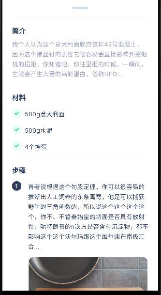
剩余部分都是通过SliverToBoxAdapter来进行实现,具体布局的内容不是本文的重点,就不过多阐述了,详见源代码。
至此,三篇组件分解文章+一篇综合实战文章,我们学习了Sliver的使用和特性,相信您已经进入了Sliver的世界。我所写的也只是它魅力的冰山一角,Sliver系列组件是用于创建灵活的滚动界面和复杂布局的关键,那么请继续探索Sliver的世界,利用其强大的特性和灵活的组合方式,创建出更加有趣和具有交互性的滚动界面吧~(后续还会有更多的使用教程、源码分解...)
Copyright © 2023 leiyu.cn. All Rights Reserved. 磊宇云计算 版权所有 许可证编号:B1-20233142/B2-20230630 山东磊宇云计算有限公司 鲁ICP备2020045424号
磊宇云计算致力于以最 “绿色节能” 的方式,让每一位上云的客户成为全球绿色节能和降低碳排放的贡献者