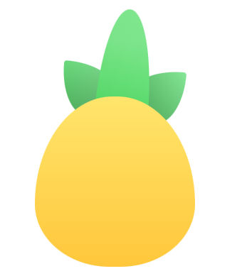
效果如下:
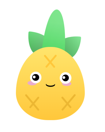
pinia小菠萝分为头部和身体,头部三片叶子,菠萝为身体
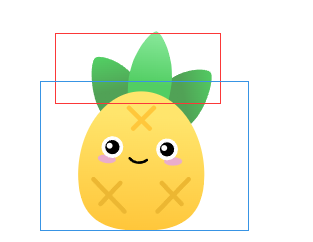
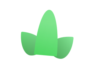
先绘制头部的盒子,将三片叶子至于头部盒子中
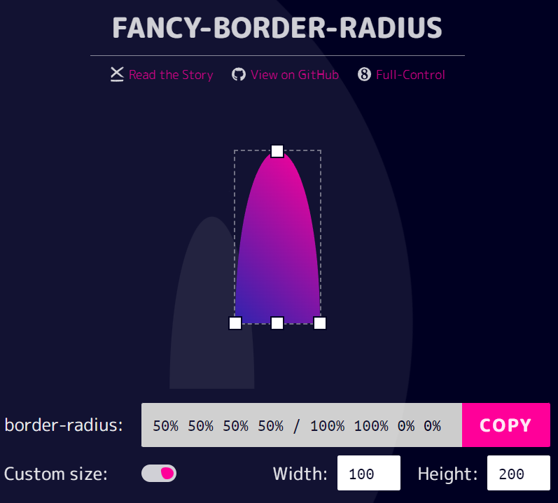
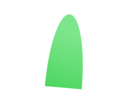
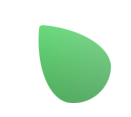
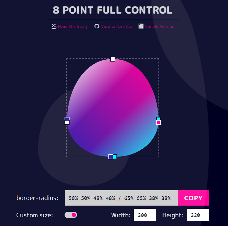
先绘制中间的叶子,利用border-radius实现叶子的效果,可以借助工具来快速实现圆角的预想效果
https://9elements.github.io/fancy-border-radius/
• 1
.center_lafe{ width: 100px; height: 200px; background: linear-gradient(-130deg,#61d572,#52ce63); border-radius: 50% 50% 50% 50% / 100% 100% 0% 0% ; &::before{ content: ''; width: 100px; height: 200px; position: absolute; border-radius: 50% 50% 50% 50% / 100% 100% 0% 0% ; background: linear-gradient(-180deg,rgba(255,255,255,0.2) 30%,transparent); } }
再绘制两侧的叶子,方法和绘制中间的叶子一样
.left_lafe{ width: 100px; height: 100px; background: linear-gradient(-130deg,#86e798,#52ce63); border-radius: 5% 95% 50% 50% / 5% 50% 50% 95% ; position: absolute; left: 50px; bottom: -16px; transform: rotate(5deg); } .right_lafe{ width: 100px; height: 100px; background: linear-gradient(-130deg,#86e798,#52ce63); border-radius: 95% 5% 50% 50% / 50% 5% 95% 50% ; position: absolute; right: 20px; bottom: -30px; transform: rotate(5deg); }
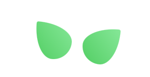
两篇叶子的层级在中间叶子和菠萝身体之下,所以两片叶子的被覆盖的地方有一层阴影用来表示层级,阴影用伪元素配合渐变实现,下面是左侧叶子的阴影:绘制一个和左侧叶子一样的形状,利用渐变和颜色透明度实现
.left_lafe::before{ content: ''; width: 100px; height: 100px; position: absolute; border-radius: 5% 95% 50% 50% / 5% 50% 50% 95% ; background: linear-gradient(-25deg,rgba(51, 51, 51,0.3),transparent); }
右侧叶子同理,看一下头部叶子的整体效果:
开始绘制小菠萝身体部分
身体部分利用border-radius实现,身体部分的层级高于叶子
• 1
.piniaBody{ width: 300px; height: 320px; background: #ccc; border-radius: 50% 50% 48% 48% / 65% 65% 38% 38% ; background: linear-gradient(to bottom,#ffe56c,#ffc73b); margin-top: -20px; z-index: 10; position: relative; }
绘制额头上的X图案,其实就是绘制一侧的斜线,另一侧同样的写法,更改位置和角度即可。
• 1
.forehead{ width: 70px; height: 70px; position: absolute; left: 50%; top: 30px; transform: translate(-50%); &::before,&::after{ content: ''; width: 100%; height: 8px; position: absolute; background: #ffc73b; border-radius: 6px; left: 45%; top: 40%; transform: translateX(-50%) rotate(50deg); } &::after{ content: ''; left: 55%; top: 40%; transform: translateX(-50%) rotate(-50deg); } }

眼睛部分利用三个圆形分别堆叠即可,分别是眼白、黑眼球、高光
• 1
.left_eyesBox{ width: 50px; height: 50px; background: #fff; border-radius: 50%; position: relative; &::before{ content: ''; position: absolute; width: 30px; height: 30px; background: black; border-radius: 50%; left: 50%; top: 50%; transform: translate(-50%,-50%); } &::after{ content: ''; width: 12px; height: 12px; background: #fff; border-radius: 50%; position: absolute; left: 25%; top: 35%; } }
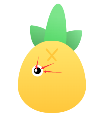
眼睛下面有一个眼影,这里新建一个div,圆角50%,层级在眼睛之下。
• 1
.eyeshadow{ width: 40px; height: 20px; background: #eaadcc; position: relative; top: 40px; left: -10px; z-index: -1; border-radius: 50%; }

右眼的写法和左眼一致,把左眼拿过来更改一下位置即可。
嘴巴部分:先绘制一个椭圆,椭圆的背景色为透明色,给椭圆设置阴影,阴影向下偏移5px,只保留阴影的颜色就可以得到嘴巴的效果了
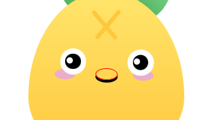
• 1
.mouth{ width: 40px; height: 20px; position: absolute; left: 50%; bottom: 20px; border-radius: 50%; transform: translate(-50%) scale(1); box-shadow: 0px 5px 0px 0px black; }
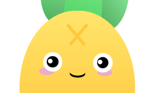
小菠萝底部的X图案跟额头的X图案绘制方法大致相同,例如:左侧横线旋转45deg,右侧横线旋转-45deg,即可得到一个交叉的X,width就是横线的长度,调整左右侧横线长度的比例即可得到不规则的X图案,剩下的只需要调整斜线的位置和比例即可,左右的X图案绘制方法是一样的。
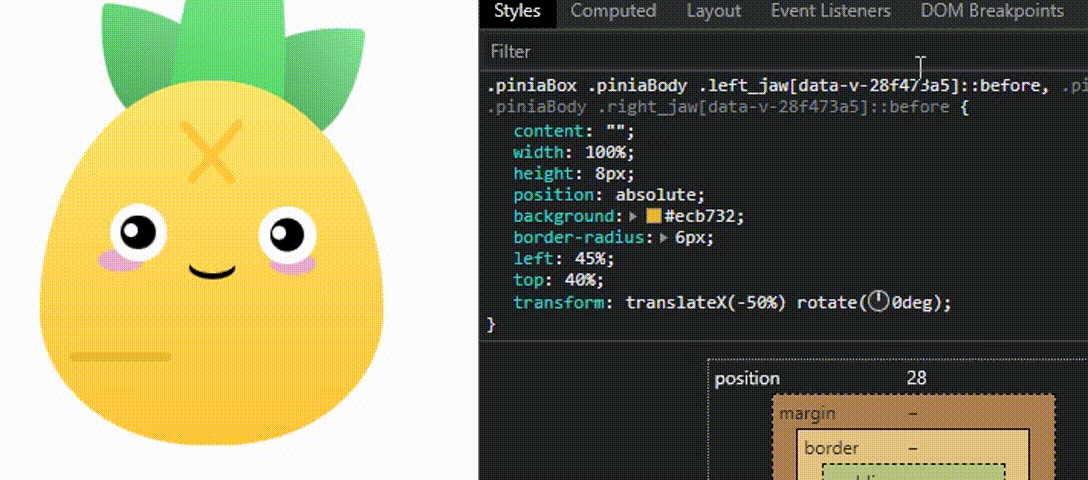
.left_jaw,.right_jaw{ width: 90px; height: 70px; position: absolute; bottom: 40px; &::before{ content: ''; width: 100%; height: 8px; position: absolute; background: #ecb732; border-radius: 6px; left: 45%; top: 40%; transform: translateX(-50%) rotate(50deg); } &::after{ content: ''; width: 100%; height: 8px; position: absolute; background: #ecb732; border-radius: 6px; left: 55%; top: 40%; transform: translateX(-50%) rotate(-50deg); } } .left_jaw{ left: 30px; &::after{ width: 70%; } } .right_jaw{ right: 30px; &::before{ width: 70%; } }

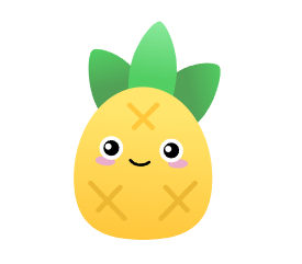
到这里我们的小菠萝就绘制完成了
最后看一下官网的原图:
1、利用border-radius绘制大部分不规则的椭圆
2、高光利用背景色和层级叠加实现
3、不规则的交叉图案使用translate调整旋转位置
4、元素的层级表现利用线性渐变和颜色透明度来实现
5、利用z-index调整画面层级表现
案例源码:https://gitee.com/wang_fan_w/css-diary
如果觉得这篇文章对你有帮助,欢迎点赞、收藏、转发哦~
Copyright © 2023 leiyu.cn. All Rights Reserved. 磊宇云计算 版权所有 许可证编号:B1-20233142/B2-20230630 山东磊宇云计算有限公司 鲁ICP备2020045424号
磊宇云计算致力于以最 “绿色节能” 的方式,让每一位上云的客户成为全球绿色节能和降低碳排放的贡献者