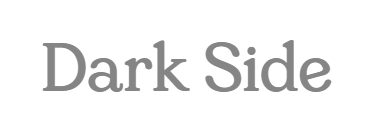
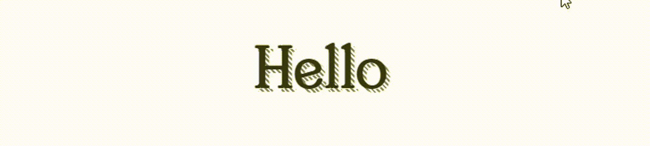
先写下一段文字
添加重复的线性渐变,该渐变倾斜45deg(倾斜角度依需求设置)
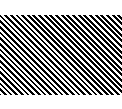
上面的为黑色、透明色的渐变,实际上渐变的颜色需要跟文字的背景颜色相同,如果文字的背景色是白色那么渐变的颜色就是白色、透明色,白色用来融入背景,透明色用来显示被遮住的文字,如下:
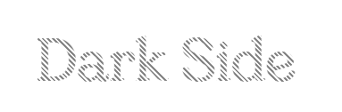
写下相同的文字,覆盖条纹阴影,调整文字的位置即可
代码如下:
Dark Side
.DarkBox{ margin:50px; width: 700px; height: 80px; line-height: 80px; text-align: center; font-family: 'GandiaBold'; position: relative; color: #858585; font-size: 60px; &::before{ content: ''; position: absolute; left: 0; top: 0; width: 100%; height: 100%; background: repeating-linear-gradient(45deg,#fff 0px 2px , transparent 2px 4px); } &::after{ content: attr(data-descr); position: absolute; width: 100%; height: 100%; left: -4px; top: -4px; color: #333333; } }
伪元素动态值
这里有一个小知识点,伪元素的的content可以设置动态值,页面标签中设置data-descr="xxx",伪元素content中的值为attr(data-descr)那么伪元素的data-descr就是页面标签中设置的'xxx',如果页面标签中的data-descr属性写成动态值,如:data-descr='textInfo',那么伪元素attr(data-descr)的值会进行关联变成动态值。
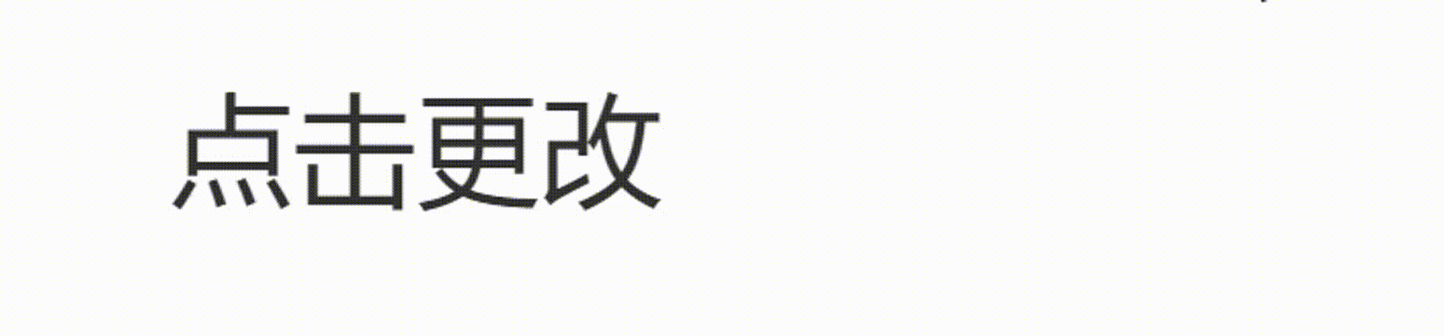
const textInfo = ref('点击更改') const textChange = () => textInfo.value = '动态值'
.text{ text-align: center; position: relative; color: #858585; font-size: 60px; cursor:pointer; &::before{ content: attr(data-descr); position: absolute; color: #333333; } }
应用在刚才的案例上:
案例源码:https://gitee.com/wang_fan_w/css-diary
如果觉得这篇文章对你有帮助,欢迎点赞、收藏、转发哦~
Copyright © 2023 leiyu.cn. All Rights Reserved. 磊宇云计算 版权所有 许可证编号:B1-20233142/B2-20230630 山东磊宇云计算有限公司 鲁ICP备2020045424号
磊宇云计算致力于以最 “绿色节能” 的方式,让每一位上云的客户成为全球绿色节能和降低碳排放的贡献者